Web Design
Professional web design: what it means in practice
Design and engineering together decide whether a visitor stays. On UX, search visibility, security and responsive design, and why they cannot be solved separately.
 Kevin A. Sommerstein8 min read

Introduction
Your website makes an impression before anyone has read a single sentence. The visitor sees a layout, waits for something to load, and draws a conclusion about the company behind it. Professional web design is about steering that conclusion, and that is not the same thing as making it look good. A beautiful website that loads slowly, is a mess on mobile or hides the contact details loses just as many customers as an ugly one.
Design and engineering cannot be separated in practice. Typography, spacing and colour contrast decide whether the text can be read. Code quality, image formats and how the page renders decide whether it appears before the visitor gives up. We build in Next.js for exactly that reason: rendering, image handling and routing are the things that otherwise fall into the gap between the designer and the developer, and that gap is where websites lose speed.
User experience and user interface
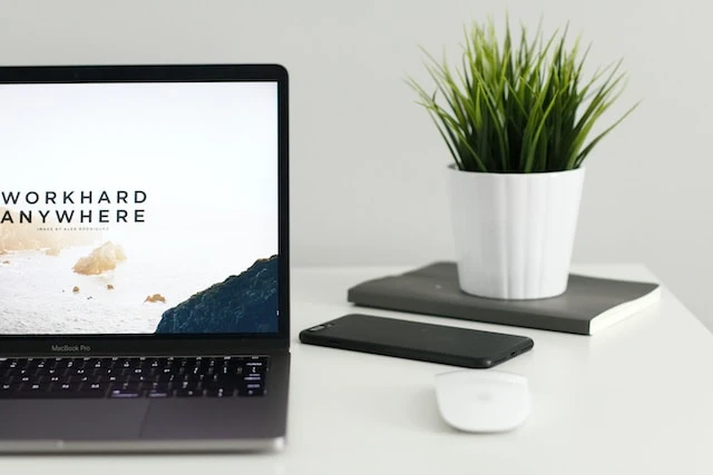
UX is what the visitor experiences. UI is the buttons, menus and forms the visitor actually clicks. The distinction sounds academic, but it shows immediately when something goes wrong. A website can have a beautiful interface and still be impossible to get through.
Most of the work is in the navigation. Someone landing on a subpage should understand within a couple of seconds where on the site they are, what the company does and where the next click leads. If that answer never comes, the visitor goes back to the search results. That is the bounce rate that later shows up in your analytics, and it is usually a navigation problem rather than a traffic problem.
Consistency builds trust, and that is not an aesthetic argument. When buttons look the same on every page, when heading levels follow the same pattern and when the same colour always means the same thing, the visitor never has to relearn the site. Sloppiness in those details reads as sloppiness in general. That is unfair to companies that do good work in the real world, but that is how it works.
Then there is the part of the user experience nobody notices until it is missing: the page loading fast and behaving the same across browsers. Most visits start on a phone, and a phone on a poor connection is the toughest test environment a website has. That is why we measure performance before we measure anything else. A design that only works on a fast computer is not finished.
Search engine optimization and visibility
Nobody sees the design of a website that never appears in the search results. Search engine optimization is therefore not something you add afterwards, but a consequence of how the page is built: what code is sent to the browser, how quickly it renders and how the content is structured.
The concrete work is heading levels that follow the logic of the content, addresses that can be read, images in the right format and pages that respond quickly. Some of it Google measures directly, through Core Web Vitals. The rest shows up indirectly: a page that feels slow loses visitors, and that signal reaches the search engine anyway.
The hard part is not knowing this. The hard part is building so that it lasts. Many websites lose their search engine optimization after the fact, when someone adds an image carousel or a third-party script that drags the whole page down. A framework that handles images and page loading for you makes that kind of addition less dangerous, and that is one of the reasons we chose Next.js.
Local search is its own discipline. A business in Malmö rarely competes with the whole country but with its ten nearest competitors. Details decide there: the address and contact details written as text on the page, the company correctly registered with Google, and the page actually naming the place it serves. Simple work, and it still makes more difference than most other things in a local market.

Security and reliability
Two things that rarely show up in a design presentation decide whether a website can be trusted: that it is secure and that it stays up.
Security
HTTPS encryption has long been a minimum requirement and nothing to brag about. What separates websites is how much there is to attack in the first place. A site built on a CMS with twenty plugins has twenty maintenance dependencies, and every one of them can become a way in. A site where the content is fetched at build time and served as finished files has far fewer moving parts.
For an online store this becomes especially clear, because the visitor hands over information that cannot be taken back if something goes wrong. The answer is almost always to not handle card details yourself but to let an established payment provider do it, so sensitive data never passes through your own server.
Uptime
It doesn't matter how good the website looks on the days it is down. Uptime has less to do with design and more with where the site is hosted and how it is delivered. Pre-built pages served from a CDN simply have fewer ways to break than a database-driven site that computes every page view from scratch.
It shows in the search results too. A website that responds slowly or is unavailable when the search engine comes by loses ground, and that position does not come back on its own the day the hosting is sorted out.
This is the boring half of web design. It never shows up in a portfolio, and it is also the first thing a visitor notices when it doesn't work.
Responsive design and different devices
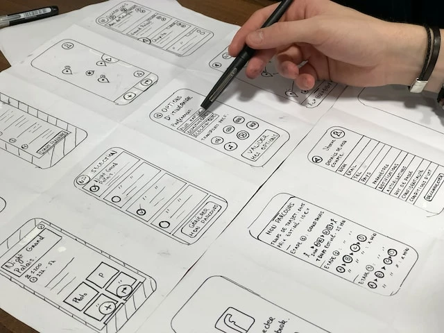
Responsive design means the same page adapts to the screen it is shown on. That sounds obvious today, but the difference is still big between a website built for mobile from the start and one that had mobile support taped on afterwards.
A website not made for mobile is recognizable straight away. The text is too small, the buttons sit too close together, and some element sticks out sideways so the whole page can be dragged back and forth. The visitor zooms, misses a button and leaves.
We start from the smallest screen and build upwards. That is not a matter of taste but an order of priorities. Starting on mobile forces you to decide what actually matters most on the page, and that judgement improves the desktop version too.
Different types of devices
Beyond phone, tablet and computer there is a long tail of devices: watches, TVs, game consoles, screen readers that render the page as plain text. Optimizing for all of them is wasted time. Building with correct HTML and reasonable contrast makes most of them work anyway, and the same work is what makes the page usable for someone navigating with a keyboard or a screen reader.
Google also indexes the mobile version of a website, not the desktop version. If the mobile experience is worse, the worse version is the one being judged.
That is one more argument for starting on mobile instead of ending there.
What decides in practice
The four parts are connected, and they fall on each other. A slow page loses the visitors it gets. An invisible page has none to lose. One that feels untrustworthy gets visits but no business. You cannot solve the parts separately and then add up the results, because the decisions collide: the image carousel that looks good in the presentation is the same image carousel that makes the page slow.
What is changing ahead
AI tools have already moved part of the work. They write drafts and generate interfaces faster than anyone can draw them by hand, which means the amount of mediocre web is growing. That does not make design worth less. It makes the difference between considered and generated clearer to anyone who looks closely.
What we don't believe in is switching technology because something is new. VR and AR have been promised on the web for over ten years without becoming relevant for an ordinary company that wants to sell a service. What pays off is still boring: faster pages, clearer structure, fewer things that can break.
If you only do one thing
Measure where you stand before deciding what to rebuild. Run the site through a performance test, look at it on a phone with a poor connection, and search for your own company name plus the town you are in. Those three things take fifteen minutes and usually say more about what needs doing than a quote does.
How we build professional websites
At Developly we build websites in Next.js where design, performance and SEO are connected from the start, instead of being solved separately after the fact. Here is what that looks like:
Test how your current website performs
Read more about how we build websites